
Opposites don’t clash, they define the narrative. In fashion, it’s never about playing safe; it’s about tension. Soft meets structured, vintage meets modern, chaos meets calm. That unexpected pairing? That’s where the magic lives. This collection explores how color tension builds identity, not confusion.
Aqua & Cocoa:
Aqua introduces a sense of calm, lightness, and fluidity. It feels open, breathable, and almost effortless. In contrast, cocoa brings warmth, richness, and a grounded presence that anchors the entire look.
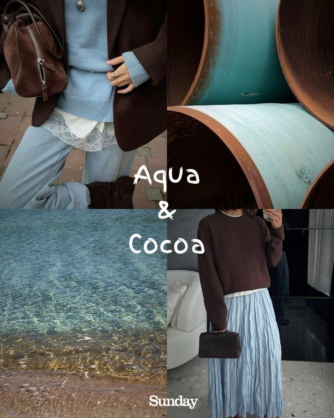
Together, they create a balance that feels natural yet refined. The coolness of aqua prevents the heaviness of cocoa from becoming overwhelming, while cocoa adds substance to aqua’s softness. It’s a pairing that speaks quietly but leaves a lasting impression.
Petal & Pistachio:
Petal tones carry a gentle, romantic energy. They soften the overall aesthetic and bring a sense of elegance that feels timeless. Pistachio, on the other hand, introduces a fresh, slightly unexpected vibrance that cuts through the softness.
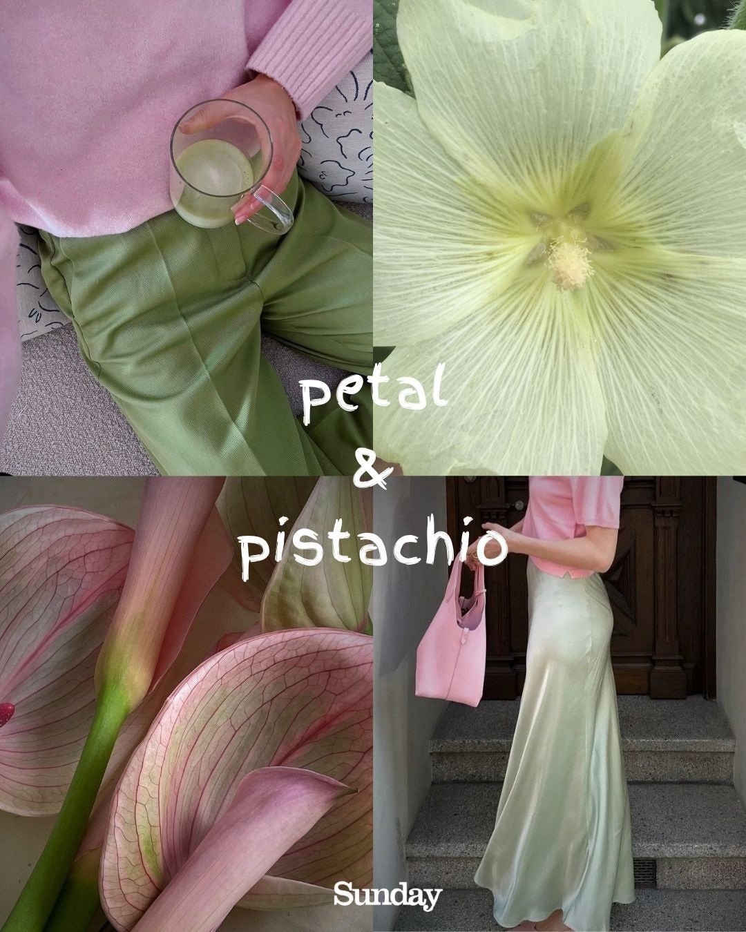
This combination feels light, modern, and effortlessly styled. It doesn’t try too hard, yet it stands out through its uniqueness. The softness of petal keeps the look approachable, while pistachio ensures it never feels dull. It’s the kind of contrast that works beautifully in both casual and semi-formal fashion.
Onyx & Chrome:
Onyx is deep, powerful, and commanding. It absorbs attention and creates a strong visual base. Chrome, in contrast, reflects light, adding a sharp, modern edge that feels almost futuristic.
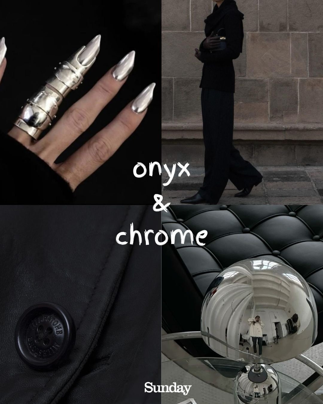
Together, they create a high-impact look that feels clean, confident, and unapologetically bold. This pairing is less about subtlety and more about presence. It’s ideal for statement outfits where precision, sharpness, and attitude define the overall style.
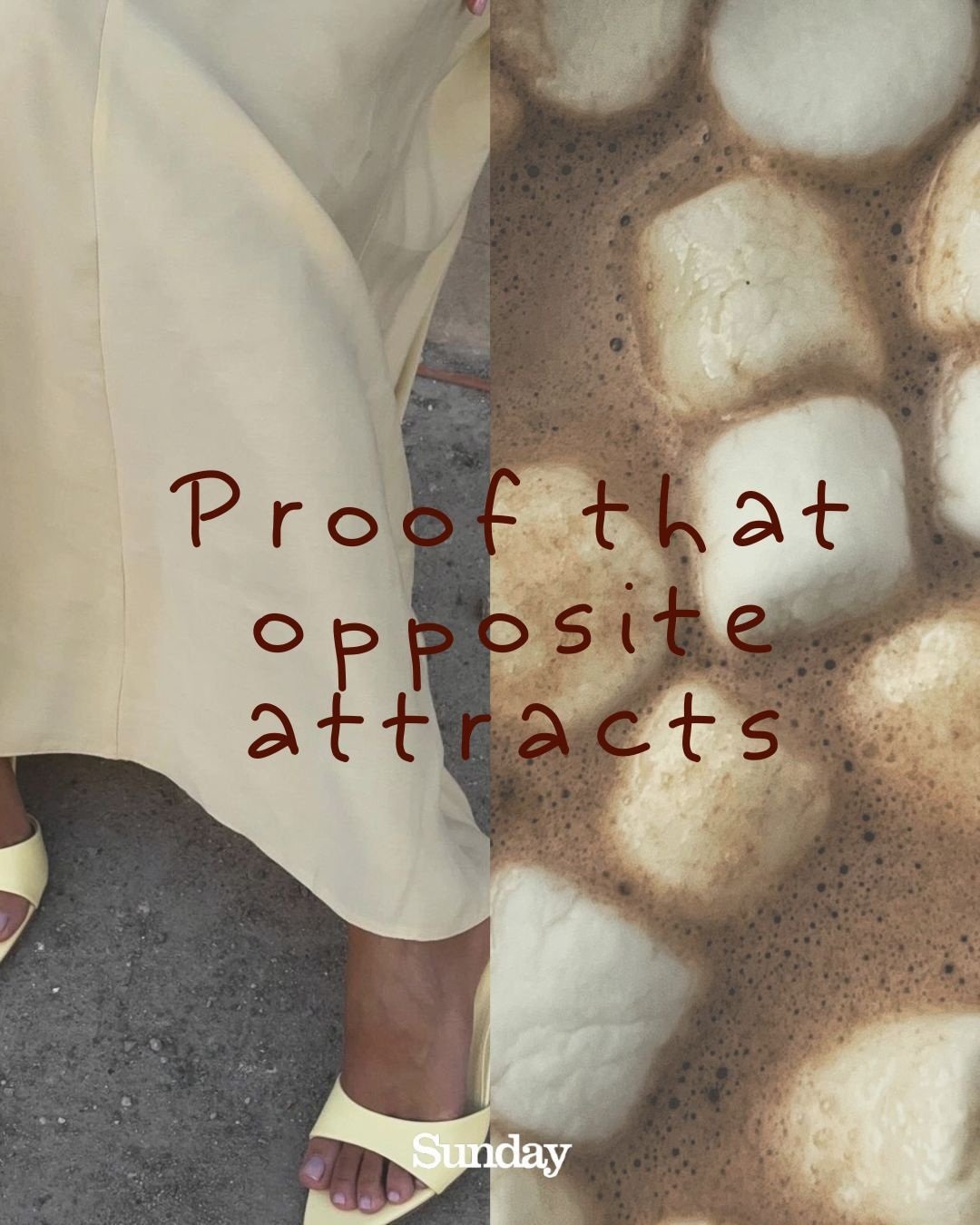
Lime & Lemon:
Lime and lemon are both vibrant, but in different ways. Lime carries a bold, punchy green energy, while lemon adds brightness and clarity through its yellow tone.
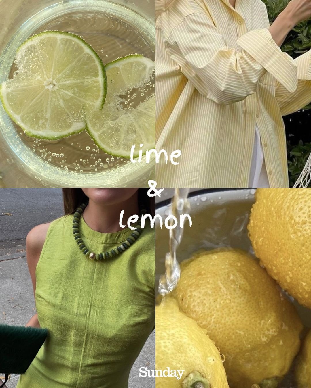

When combined, they create a look that feels alive, energetic, and impossible to ignore. This pairing thrives on visibility – it’s fresh, youthful, and full of movement. Perfect for styles that aim to capture attention instantly while still feeling playful and modern.
The Final Statement:
Contrast is what transforms fashion from simple clothing into a visual story. It allows different elements to coexist, interact, and elevate each other. Instead of blending in, contrast creates identity – it defines the mood, the attitude, and the presence of a look.